|
|
Post by davemorris on Feb 20, 2008 11:58:14 GMT
I've spoken to Andy Cox and we ahould be able to avoid paying the VAT on the kit. so that should make it cheaper for us all.
I agree that it would be better without a crest on the left brest. how about switching it so that the main colour is black and the swoopy bit are yellow. would be easier to keep it clean anyway.
Yer the aim is to get it done ASAP, but we don't want to rush it and end up with a shit kit because the idea is that once it is sorted it will be set up for years.
The more people who order it the better as the company have said that if we order enough kit they will half the set up fee for us.
|
|
|
|
Post by andysteel on Feb 20, 2008 18:53:35 GMT
Im in for shorts and a jersey, as said last week. Sorry wasnt out today, had bike mechanical issue leading to me not riding, even had all lycra on ready nd was going to head out and do an hour beforehand as lecture finished early. WIll be back out on road on sat, wayyheyy!!! Grindstone is good idea michael like that. Basice jersey design looks good edd, I think having Sheff Uni CC or somat would look better than just SUCC written everywhere. I have enough people asking what DISS stands for!
|
|
|
|
Post by EdHarris on Feb 20, 2008 21:58:48 GMT
Well I've lost the Borat-esk thongs and reversed the colours so it's mainly black. I'm guessing that we wouldn't really need to put 'cycling club' on the jersey we'll be wearing them on our bikes. I agree that a logo might not be totally necessary, though I still think the Michael's peaks millstone idea would be good if chose to have a logo. I'm really just playing around, if you think these are naff then say so and I'll stop fannying around on paint.  |
|
|
|
Post by simoncpe on Feb 21, 2008 0:09:16 GMT
I think i would feel slightly Banana'ed in that and as were getting it done professionally i think we should try to get a slightly more intricate design. Im not trying to say your design is crap ed its good to see someone trying i just think were keeping this kit for the foreseeable future lets get it spot on !!!!!
|
|
|
|
Post by simoncpe on Feb 21, 2008 0:31:08 GMT
|
|
|
|
Post by EdHarris on Feb 21, 2008 0:40:51 GMT
Aye, you're right, we're paying the company to do it for us and they've done it 100s of time before.
I'll let them do it!!
|
|
|
|
Post by simoncpe on Feb 21, 2008 0:47:34 GMT
|
|
|
|
Post by Michael on Feb 21, 2008 7:57:36 GMT
I really think it needs to be simple without under lying messages or 'jokes', as this will keep the kit popular in years to come. Maybe just a simple icon of sheffield, without any bikes involved.
Icons of sheffield i have found include: cutlery/steel, grinding stone, Arts tower and the two cooling towers. As the fate of the cooling towers is uknown, probably best not to use that.
|
|
|
|
Post by adamd on Feb 21, 2008 9:23:05 GMT
Simon, that Salem cycle one is great (first link)! I really like the idea of getting something 'unique' on the jersey rather than just a standard colour block kinda thing.
|
|
|
|
Post by Michael on Feb 22, 2008 8:13:38 GMT
  They could be simplified more. Any thoughts? |
|
|
|
Post by davemorris on Feb 22, 2008 12:38:10 GMT
I quite like those logos. They maybe need a bit of refinement but the general concept is good. Simple is best, but with an element of originality. Not sure about the sheep thing as the kit has to be relevant to club members in 4/5 years time.
If we could get away with having our secondary colour as blue instead of yellow then it might avoid the bumble bee/ banana look, but I'm not sure how the uni would feel about that.
We’re making good progress though.
|
|
|
|
Post by Michael on Feb 22, 2008 15:42:33 GMT
Yes they were v.quick sketches:
The 'swirls' were to make it look like it was moving.
It might not work if it was in 2D (??).
I wasnt sure about the text i assume people would know what 'CC' means.
A way of avoiding bumble bee look is to have large patches of colour, instead of strips. Or make the collar sleeve bands and waist band yellow
|
|
|
|
Post by simoncpe on Feb 23, 2008 12:33:32 GMT
 My first attempt in 5 years of using photo shop but .......il keep trying |
|
|
|
Post by simoncpe on Feb 23, 2008 12:49:15 GMT
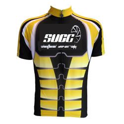 I swapped the logo for the one jolly designed thought you could see which you prefered Im going to try and come up with a logo based on the old cooling towers. |
|
|
|
Post by simoncpe on Feb 23, 2008 13:19:17 GMT
 Right thats me done, If people can let me know which logo they like and if the basic design for the jersey is acceptable. |
|